
In the construction industry, managing projects involves more than just building blocks. Construction professionals handle many daily tasks, from creating accurate drawings to construction planning. This complexity can make it challenging to stay organized.
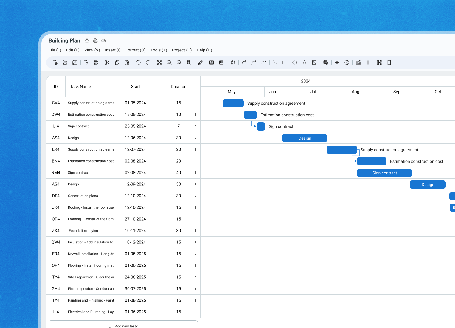
Task Aid is a comprehensive construction project management system designed to streamline and optimize the management of construction projects, regardless of whether they are related to architecture or civil engineering.
Our client is a Saas provider, which has decided to redesign the old platform and add new features. The previous system was outdated, had a complex user interface, and required installation to function properly. Additionally, the computer had to be set up in Japanese for the PC app to work, which created significant challenges for my team.

By transitioning the application to a web-based platform, we can eliminate these issues and provide a better user experience along with improved collaboration.
Client Challenge
The client aimed to improve their current product by integrating new functionalities and refining the overall user experience. The goal was to create an intuitive interface while ensuring the platform remained powerful enough to handle the complexities involved in construction planning.
Research Phase
Client Meetings
We kicked off the project with meetings to gather detailed requirements from the client. This included discussions about user needs, pain points with the existing product, and desired features.
Collaboration with the Project Manager
I worked closely with the project manager to understand the scope, timelines, and deliverables, ensuring everyone was aligned and clear on the project objectives.
Involving Developers Early
I involved the developers early in the process to discuss the technical framework. In this case, we decided to use Tailwind UI for its utility-first CSS approach, which allows for faster UI development.
Design Phase
Creating Mockup
I started by creating a wireframe and a mockup for the application’s first screen. I then presented these design concepts to the client to ensure we were on the same page regarding style and layout before proceeding.
Establishing the UI Foundation
Next, we set up the UI foundation, including color schemes and typography. This foundation helped maintain a consistent look and feel throughout the application.
I made every effort to reuse the existing library to minimize developers’ workload, which will help us deliver the final product more quickly and effectively. I used the Roboto font.
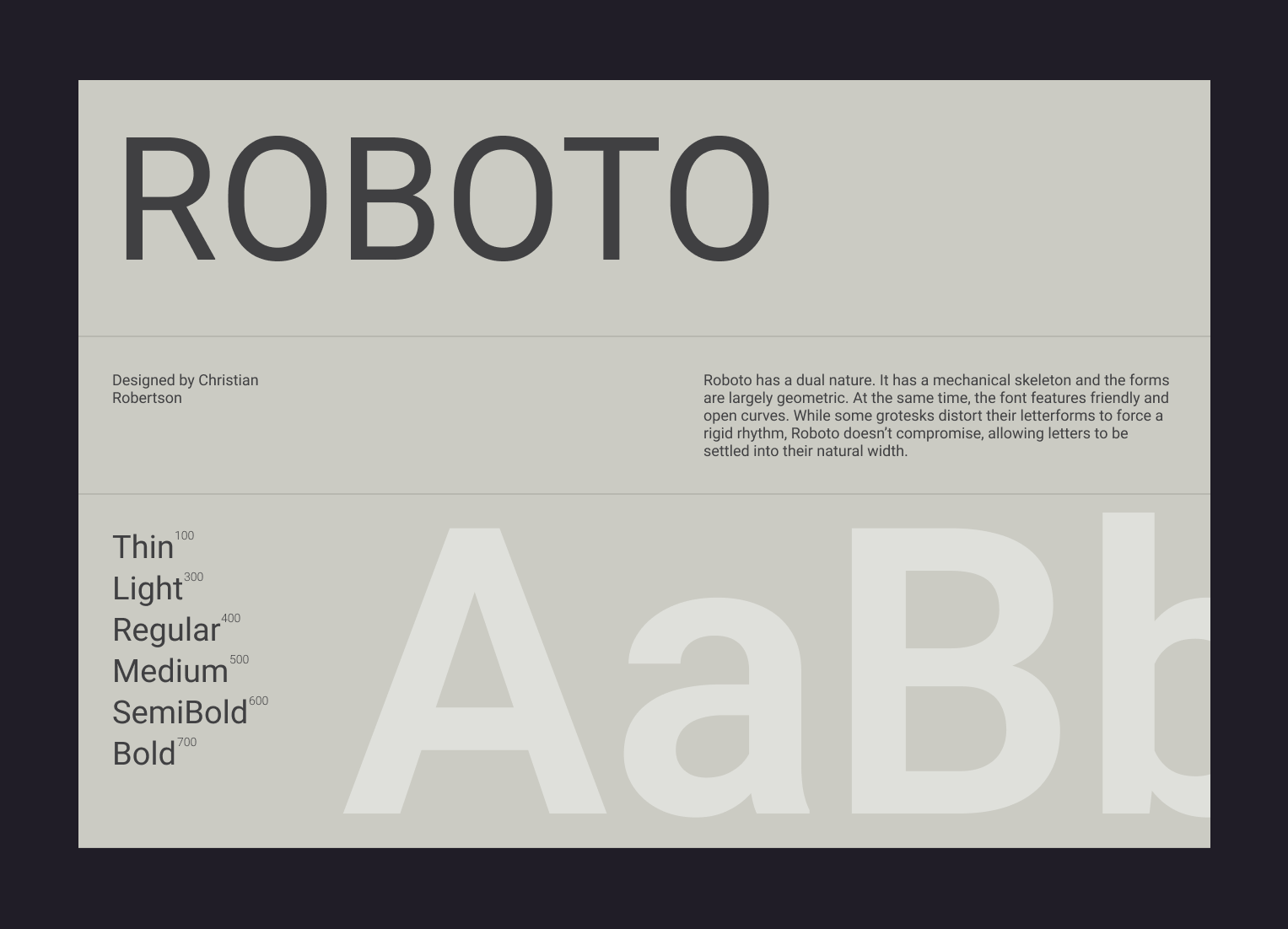
The primary colors were green and blue, and I also reused color variations from Tailwind Material UI.
Managing an Evolving Scope
Since the project scope wasn’t fixed, we kept communication open with the business analyst (BA) to document any new feature requests from the client. This agile approach allowed us to adapt quickly and implement changes as needed.
Iteration Phase
Adjusting Designs
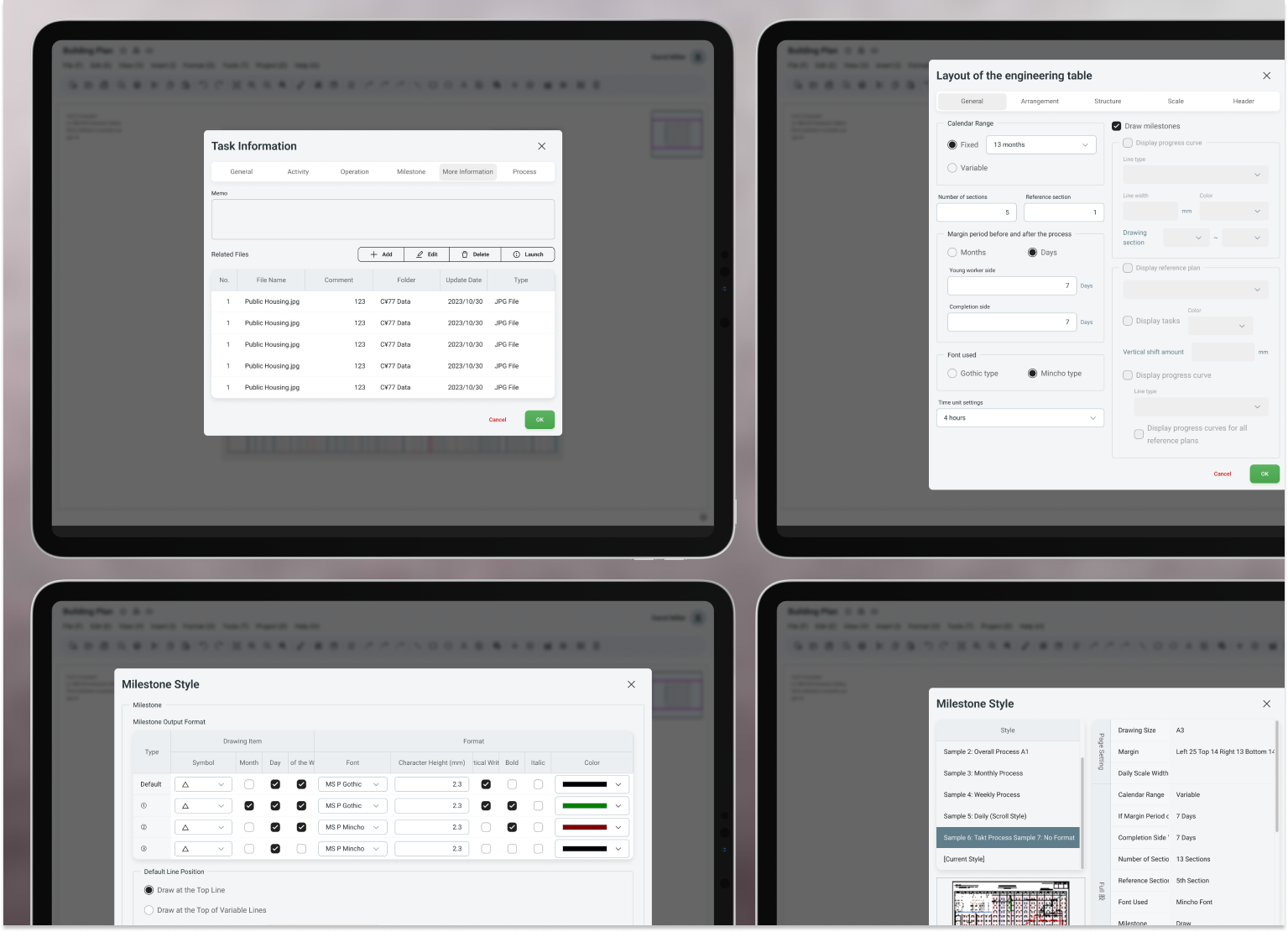
I received ongoing feedback from the client. After discussing it with the project manager and the developers to confirm the designs were feasible within our technical constraints, I revised the designs and assigned them back to the development team.
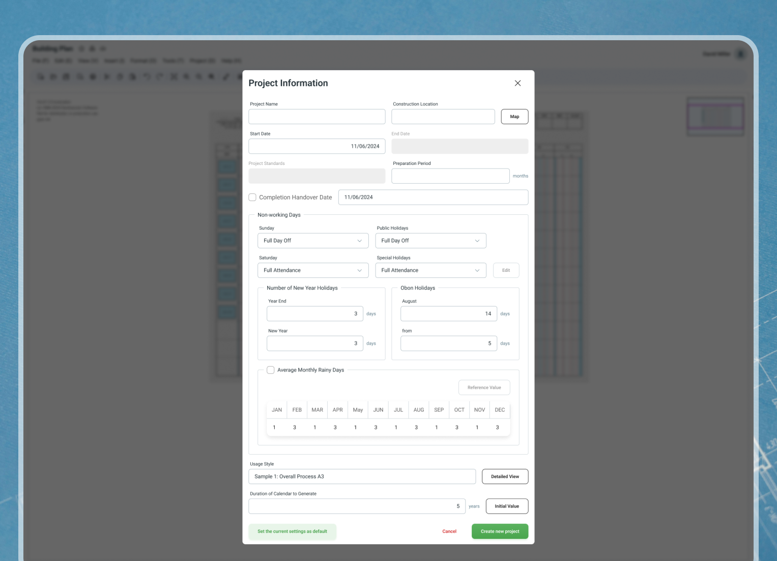
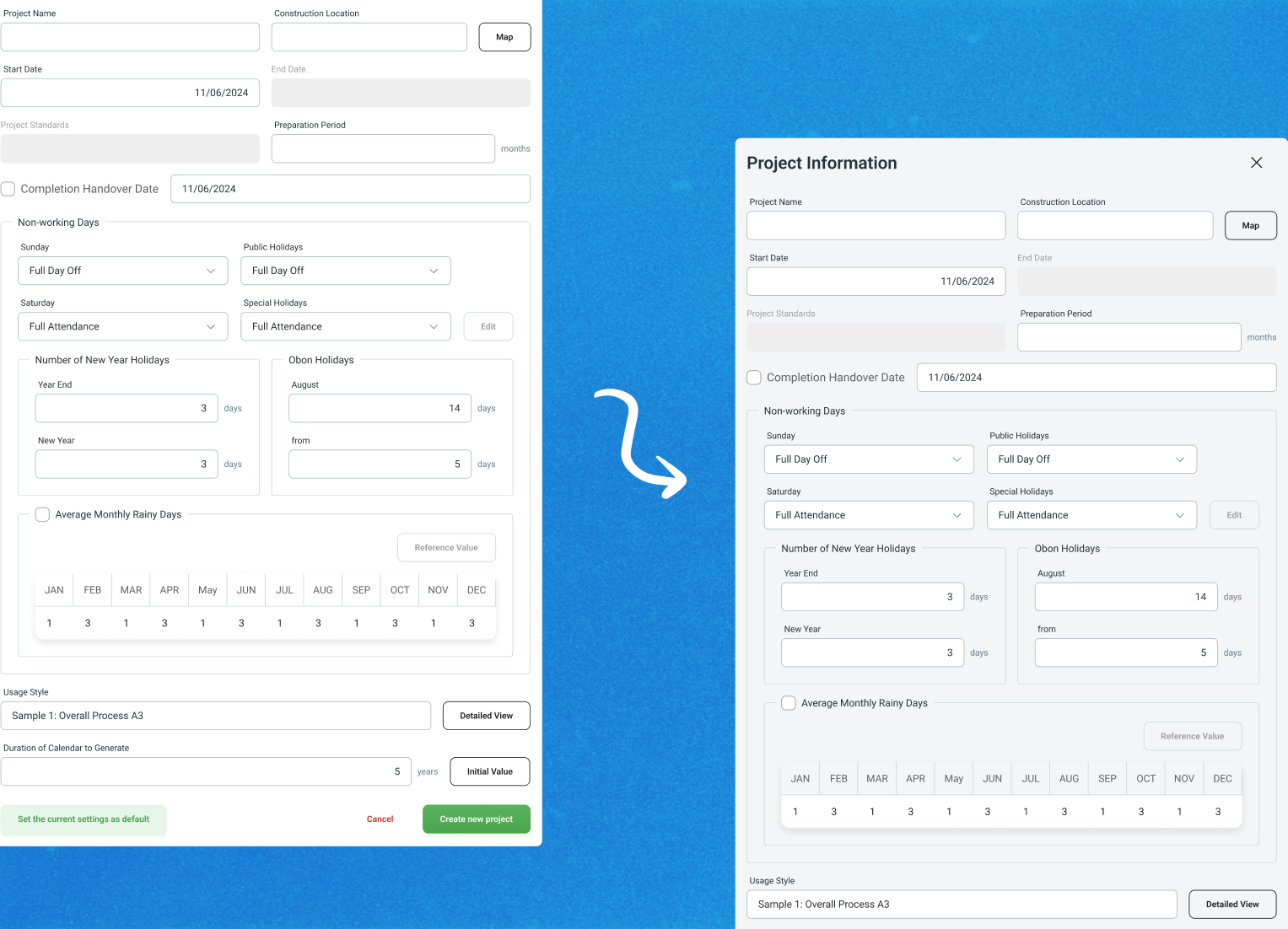
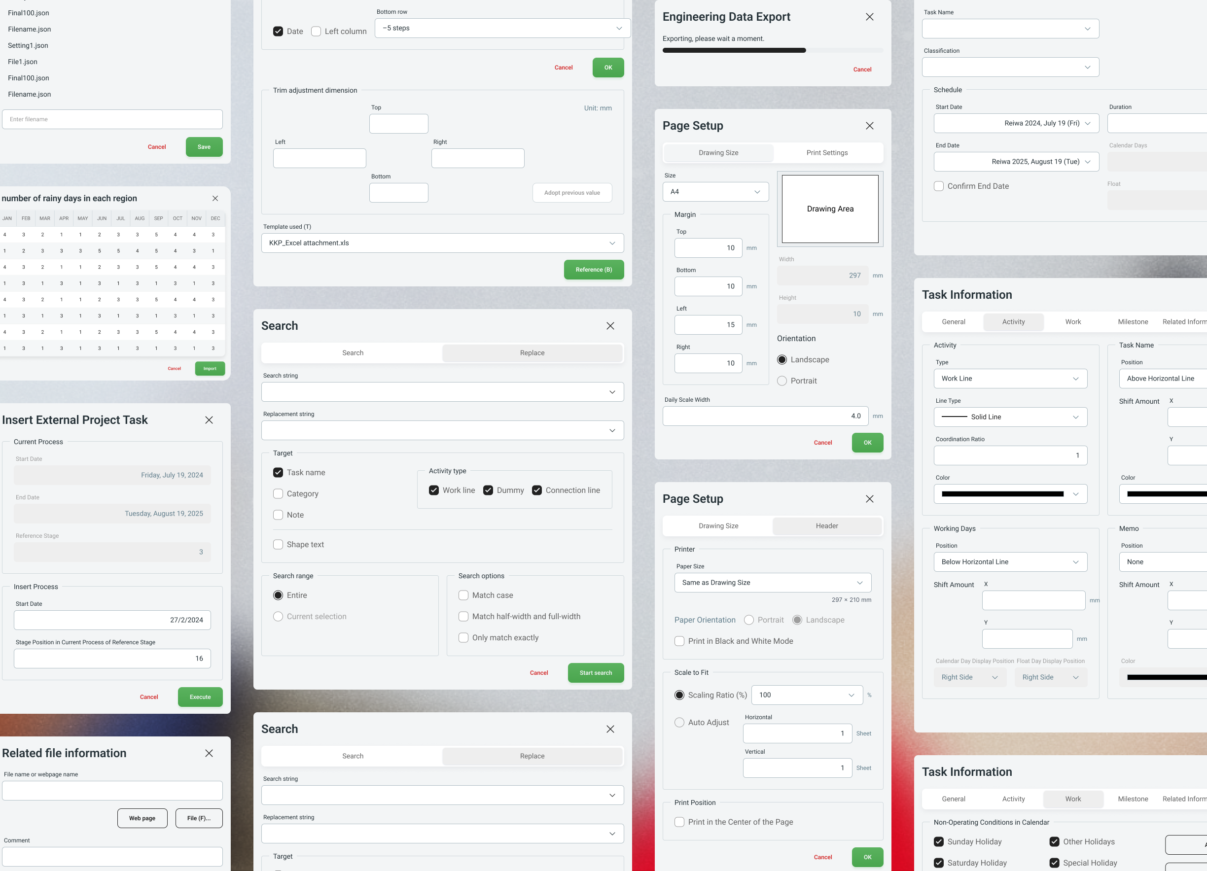
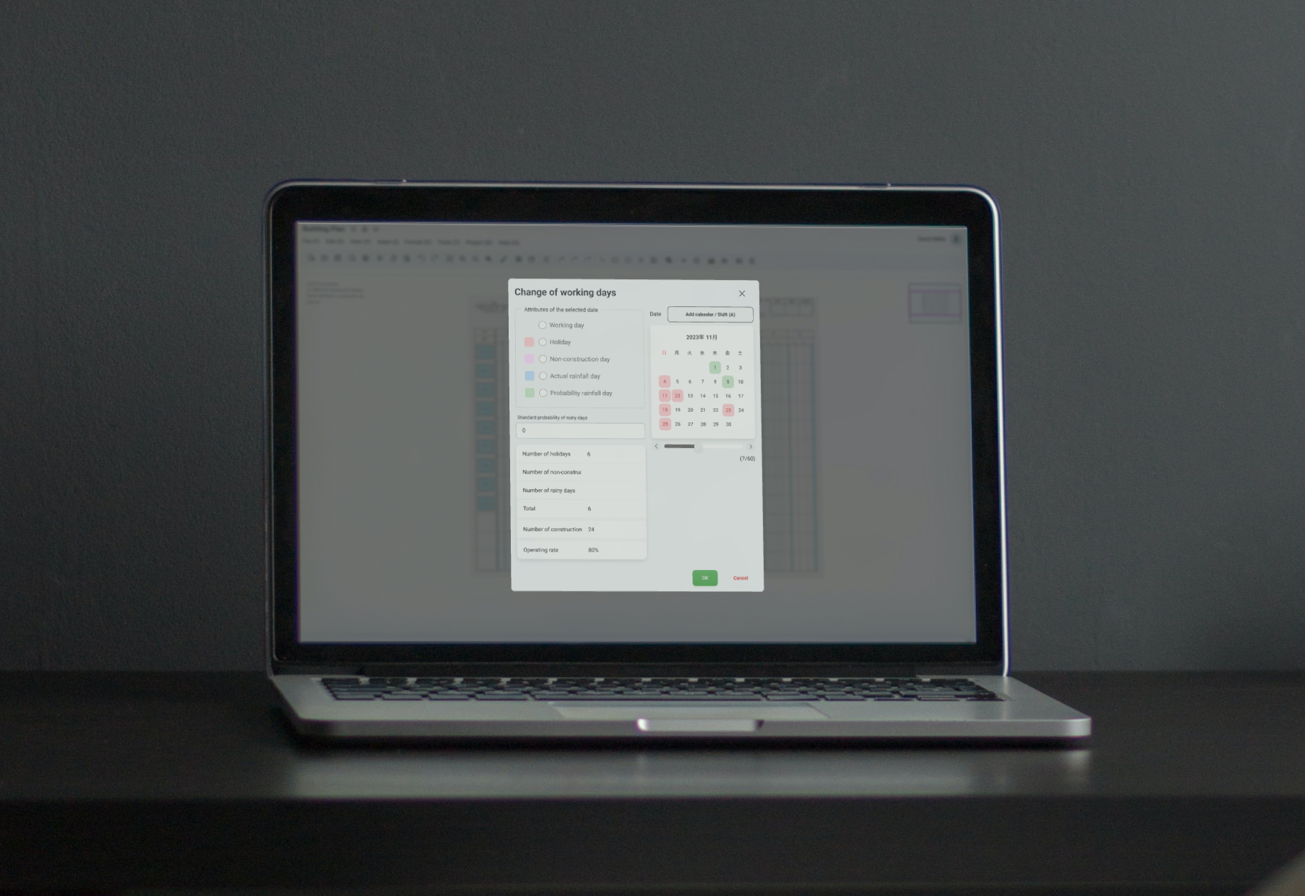
One of the client’s feedback was that the form felt overwhelming. I realized this was due to my overreliance on lines as visual dividers, which would create visual clusters. It’s best to use lines only if the content cannot be effectively divided in another way. Too many lines can overload the screen with visual noise and create unnecessary visual tension.
To address this, I decided to use a grey background to separate the background from the content above it, helping users to focus more on the fields.
Prioritizing Features
As new features came in, given the complexity of the project, the development team had to prioritize essential features. I worked with them to identify the core functionalities that would provide the most value to users while balancing performance and usability.
Outcome
So far, I’ve met all the SaaS design timeline requirements. This has given the development team to wrap up the product before testing starts.
The client is satisfied with the final design, noting that it aligns with their vision and goals for the product.
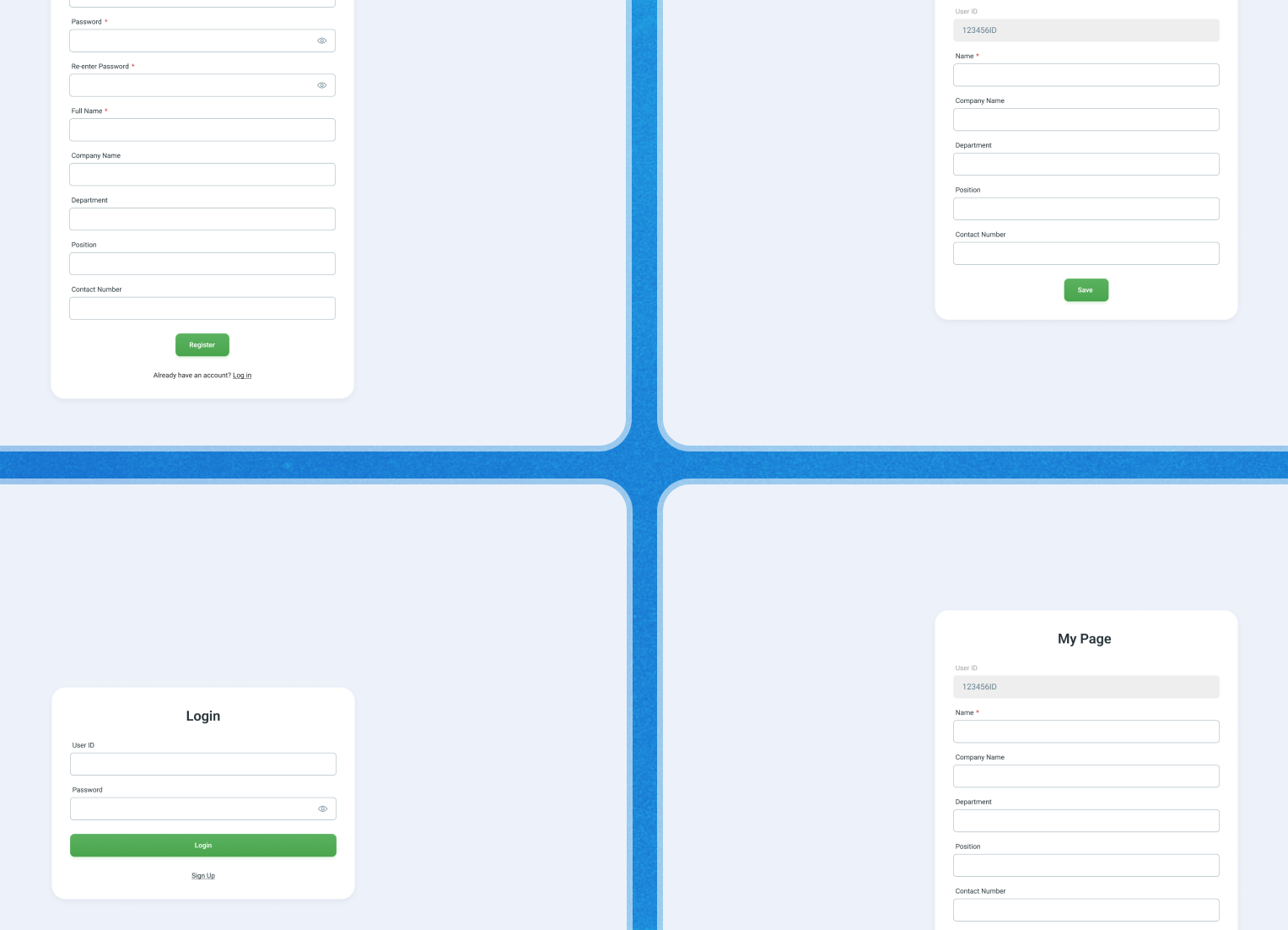
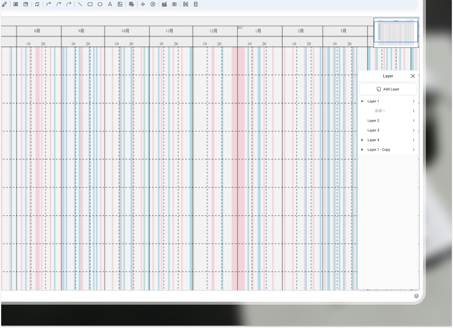
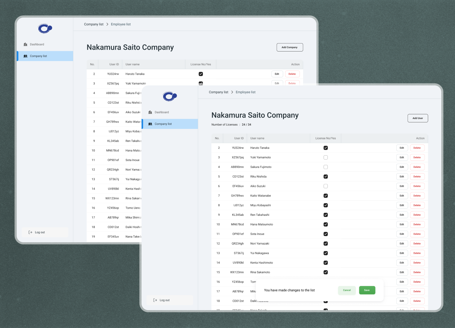
Admin Site
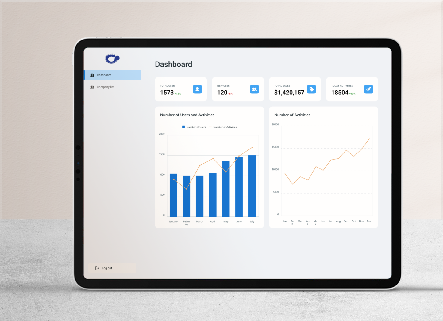
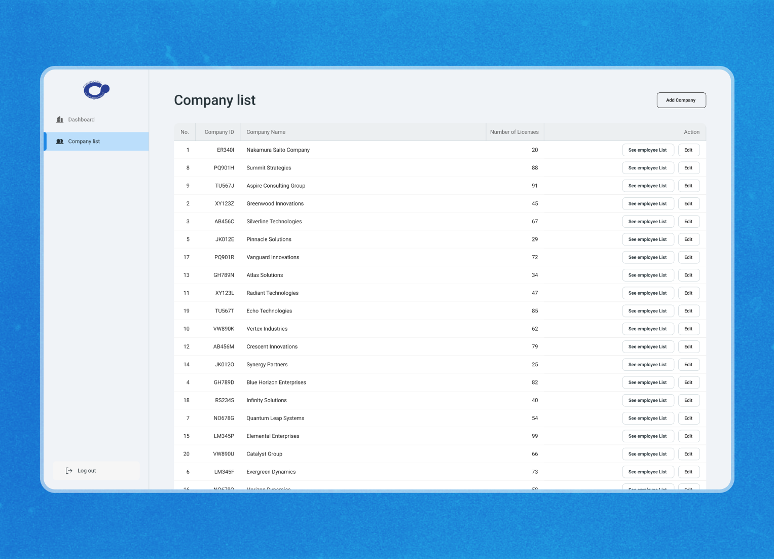
I also created an Admin site to manage the Saas subscribers. The admin site featured a basic grey-blue background to minimize distraction. The dashboard page provides an overview of the product and sale performance, and the list page allows for managing the company’s clients and licenses.
Conclusion
In conclusion, the redesign of the Task Aid platform is set to improve project management for construction professionals. Moving to a web-based application has made the user experience smoother and enhanced team collaboration.
Throughout the design process, I actively sought client feedback and worked closely with developers to minimize the workload and time spent.