
About the Client and Project
2M is an audiobook app that is part of the MTT business. MTT has been a long-standing partner of our company, and I have collaborated with them on several projects, including this one. MTT operates in the education domain, offering courses, coaching videos, and more. They are now focusing on developing an app that provides audiobooks and podcasts, primarily on education and self-help topics.
Problem
Communication
I couldn’t conduct one-on-one interviews with the client at the beginning of the design phase. I received the project requirements while working on another project, and both the client and I were busy, so our schedules didn’t align. As a result, I had to work with what I had—a vague understanding of the product and a list of functions that could change over time.
Balancing Business Goals
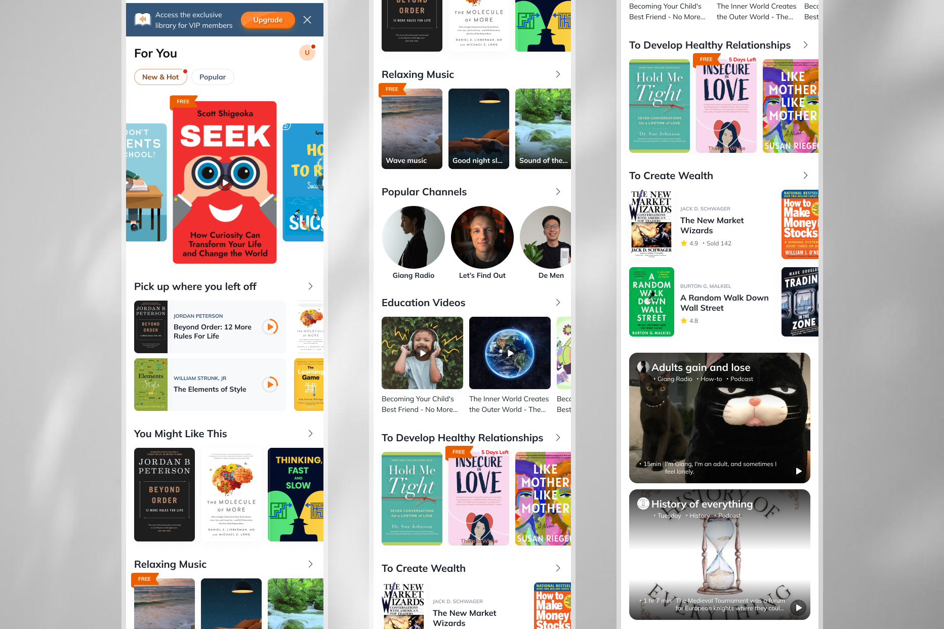
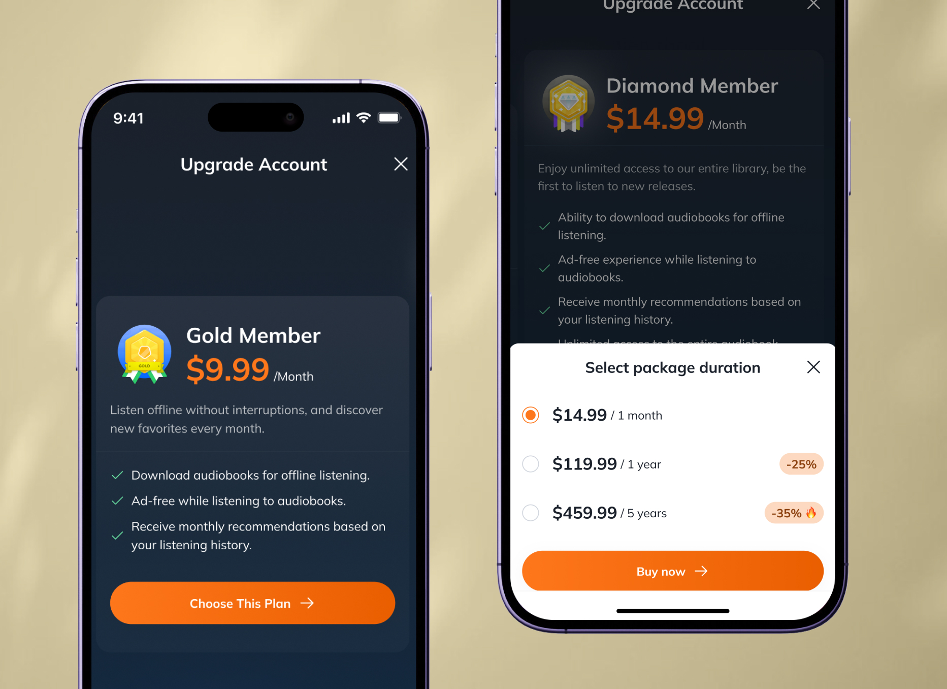
As a UX designer, my job is to balance user goals with business objectives. In this case, the client wanted to maximize conversions by placing ads and promotional banners with multiple packages.
Technical Constraints
There are some technical constraints when designing apps that can require significant effort or slow down performance.
My Approach
Prepare for Flexibility
Typically, after gathering all the client requirements and understanding their needs, I jump straight into mockup design while collecting their feedback. For this application, I needed to adopt a more flexible approach to respond to changing requirements. I started with high-fidelity wireframes and gradually refined them based on feedback.
Designing with User Goals at the Center
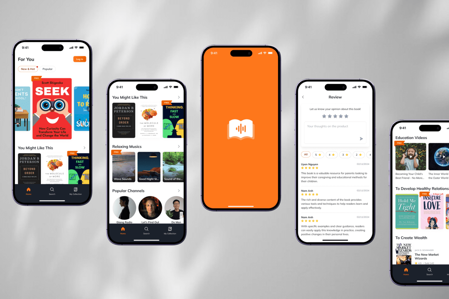
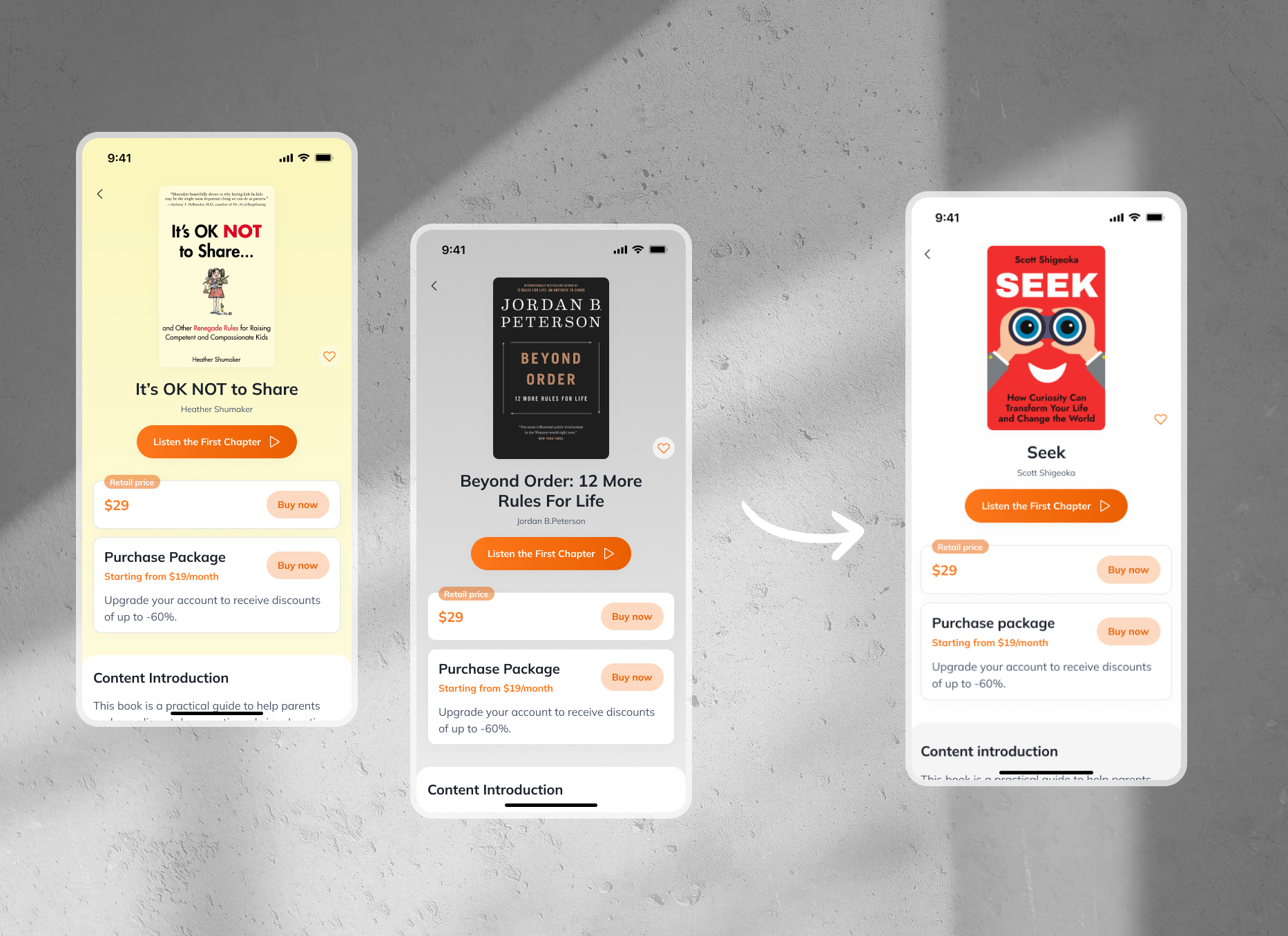
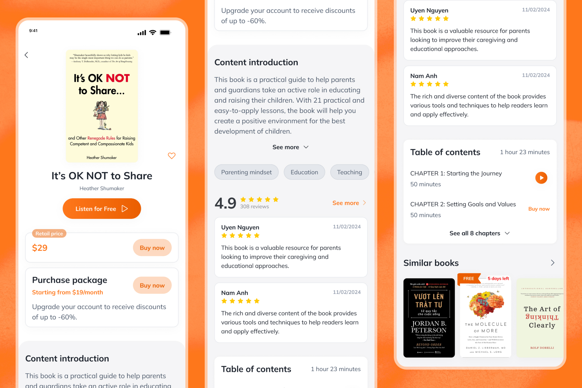
After discussing how to meet user goals while aligning with the business’s objectives, I convinced the client to reduce the number of promotional ads and limit their promotional packages from four to two—gold and diamond. Too many options can hinder users’ decision-making.
Involve the Development Team Early in the Process
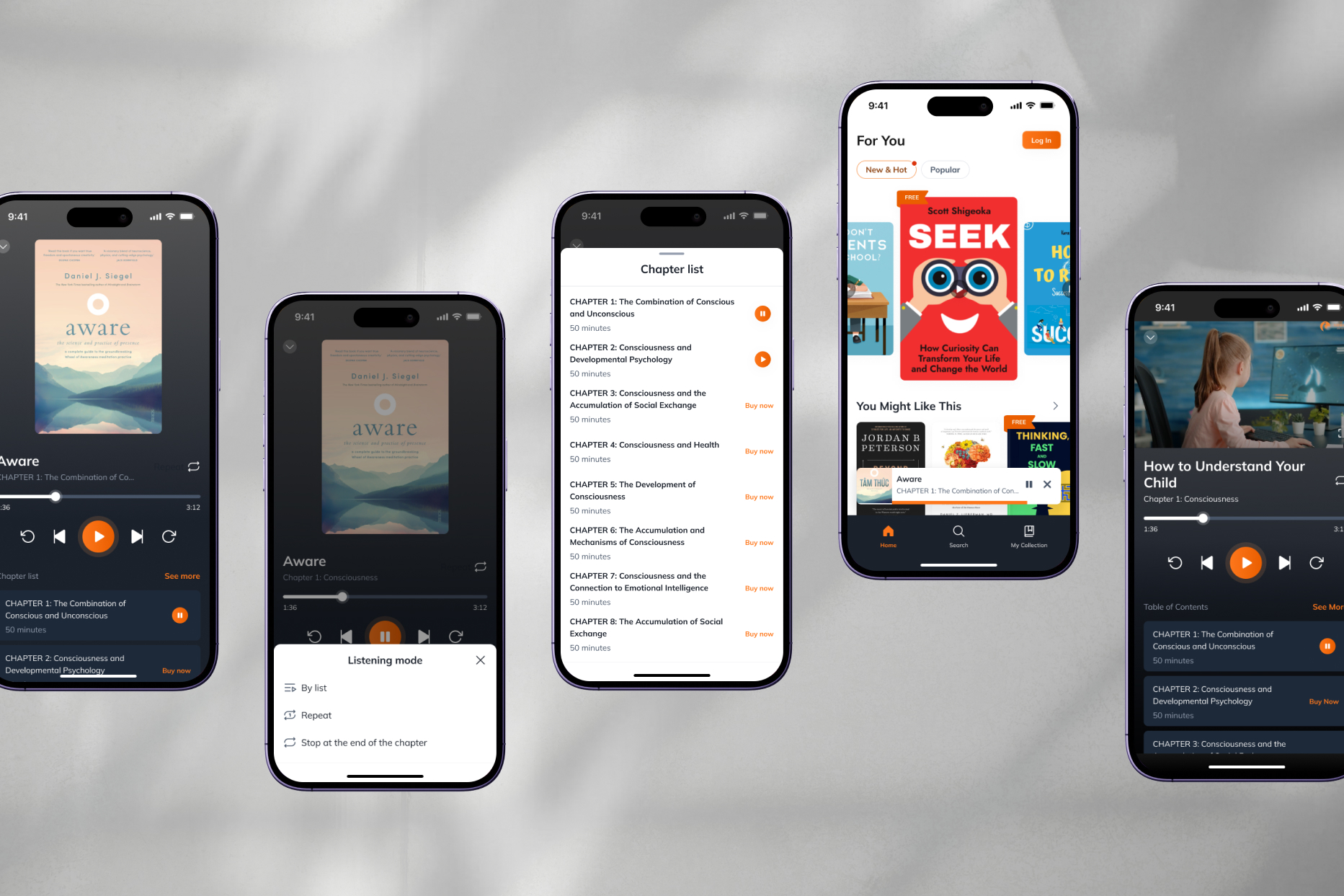
I involved the development team early in the design process to understand the technical constraints. Initially, I wanted to match the app’s background with the book covers on certain pages. However, after discussing it with the developers, they noted that this could slow down the app due to the need for a different framework.
So, I reverted to a simple white background.
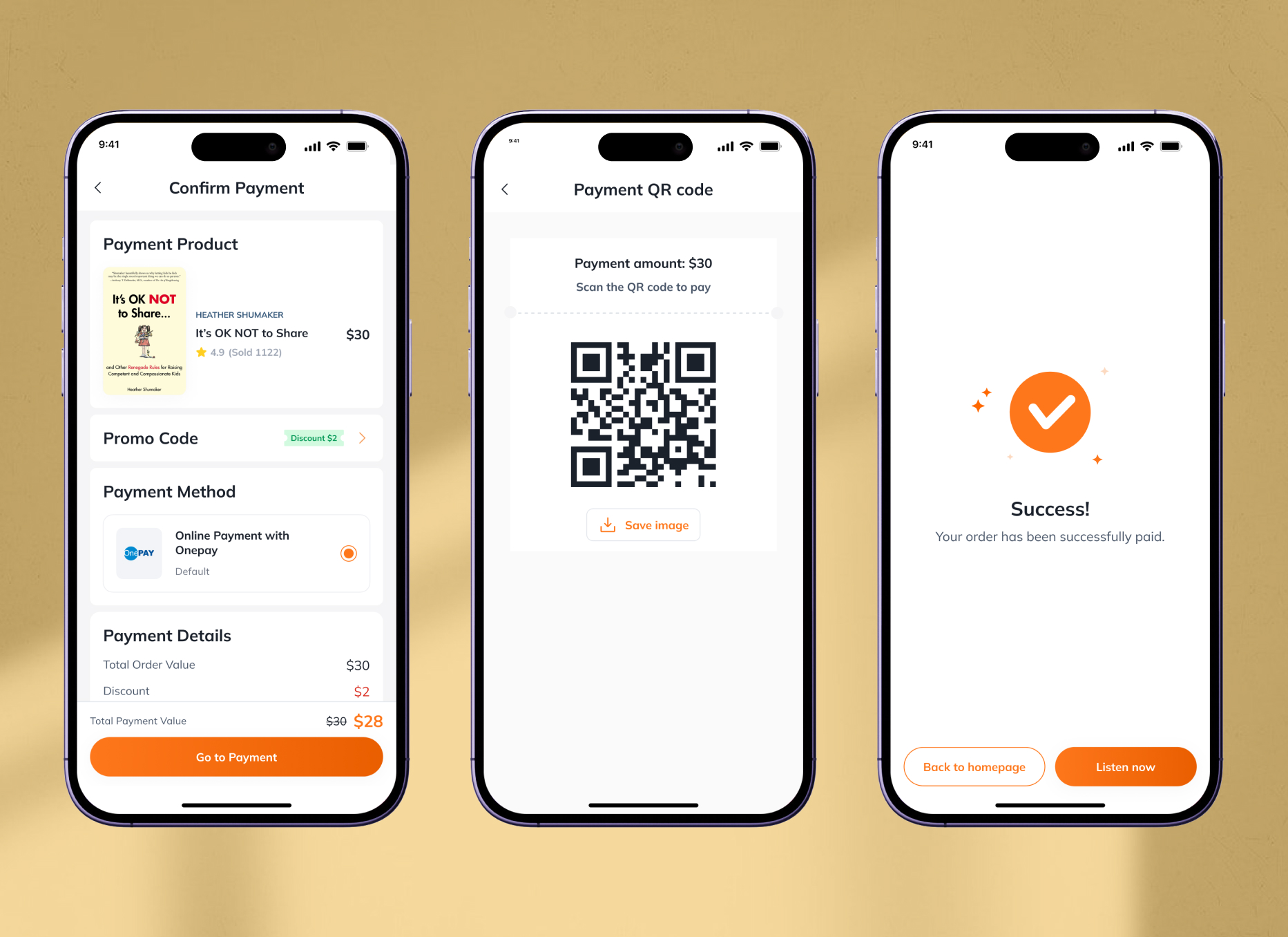
Design
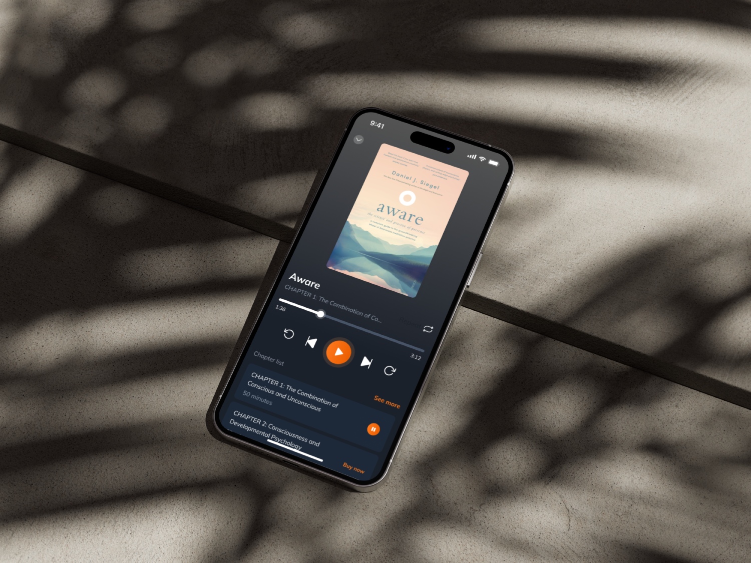
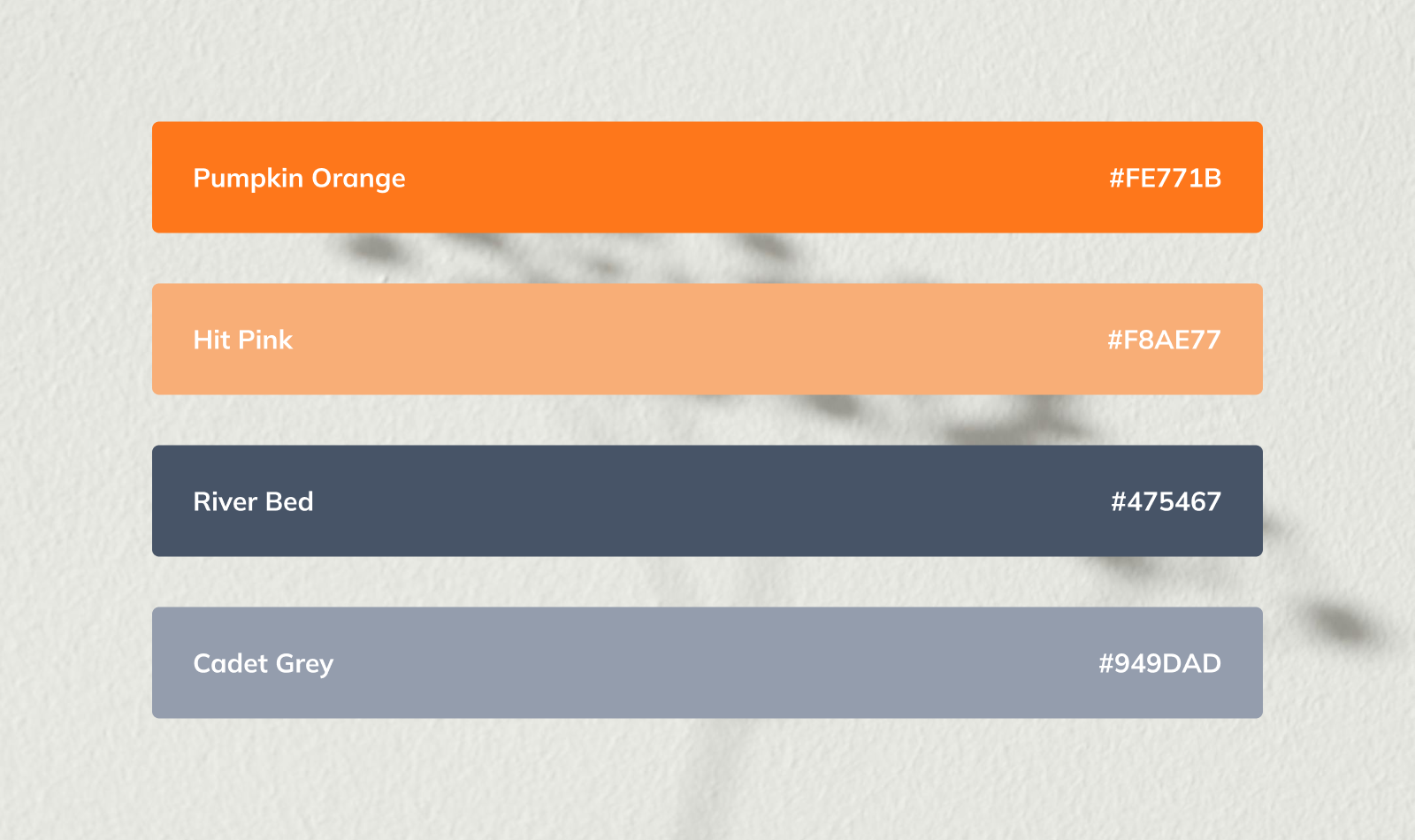
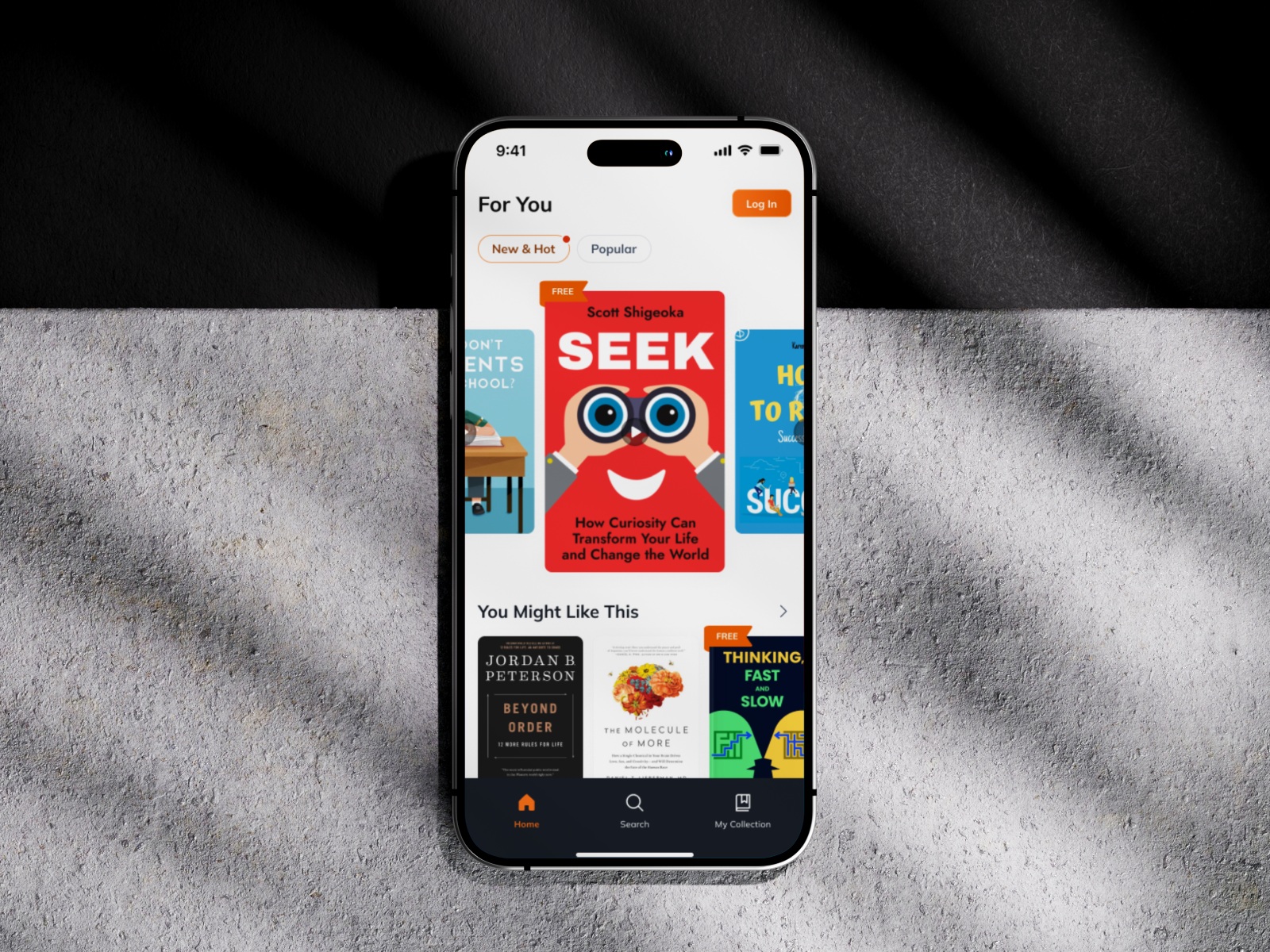
The main accent color of the application is orange because it aligns with their brand guideline, combined with bluish-black and white.
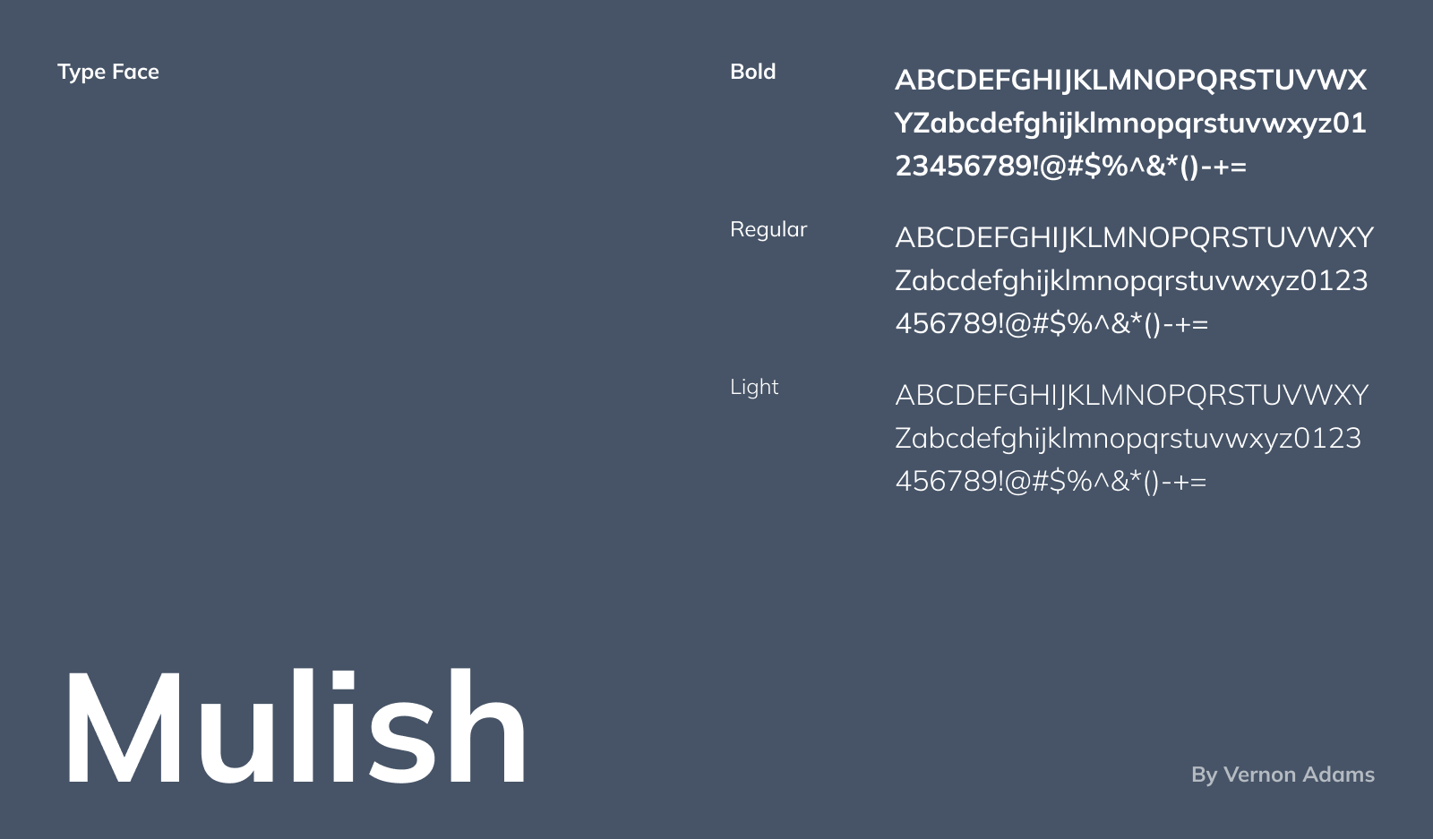
The typography choice fell on neat and readable Mulish.
The core target audience was quite clear and limited in preferences and background so it helped me envision my design easier. The main target users of the application are parents who want to learn how to raise their children better.
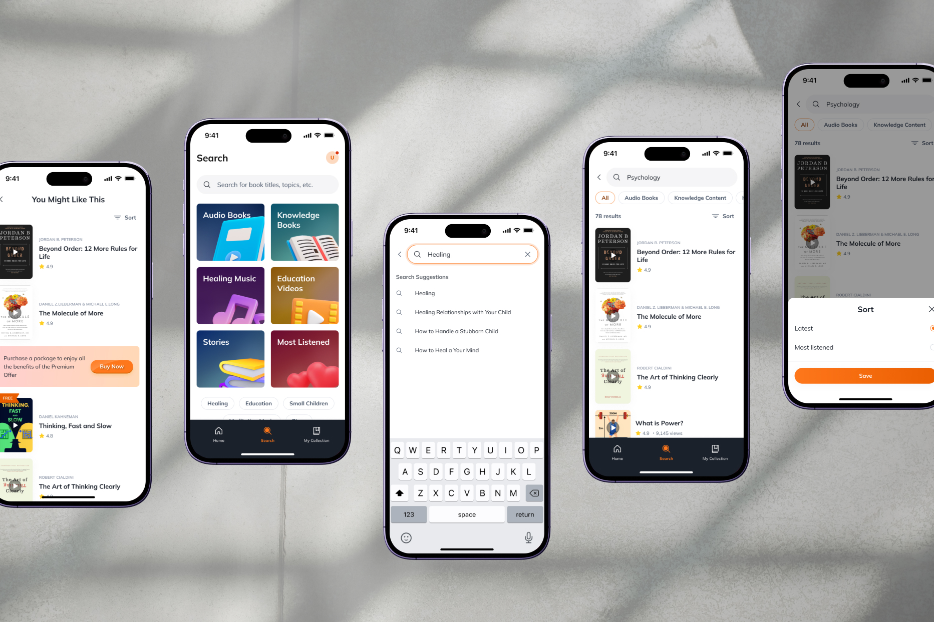
As the target audience is not typically tech-savvy, I tried to make the design as intuitive and clear as possible.
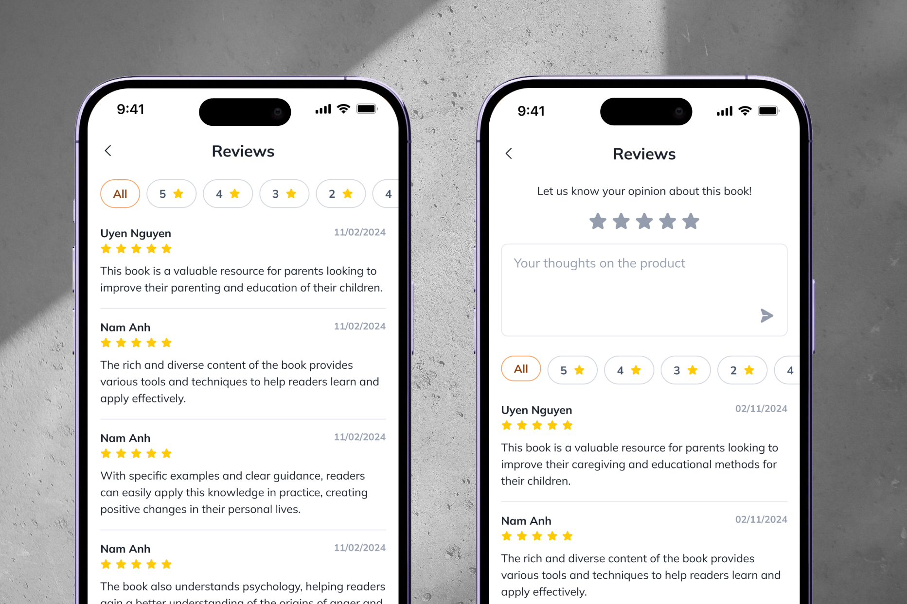
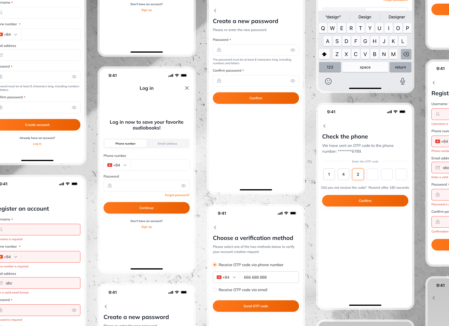
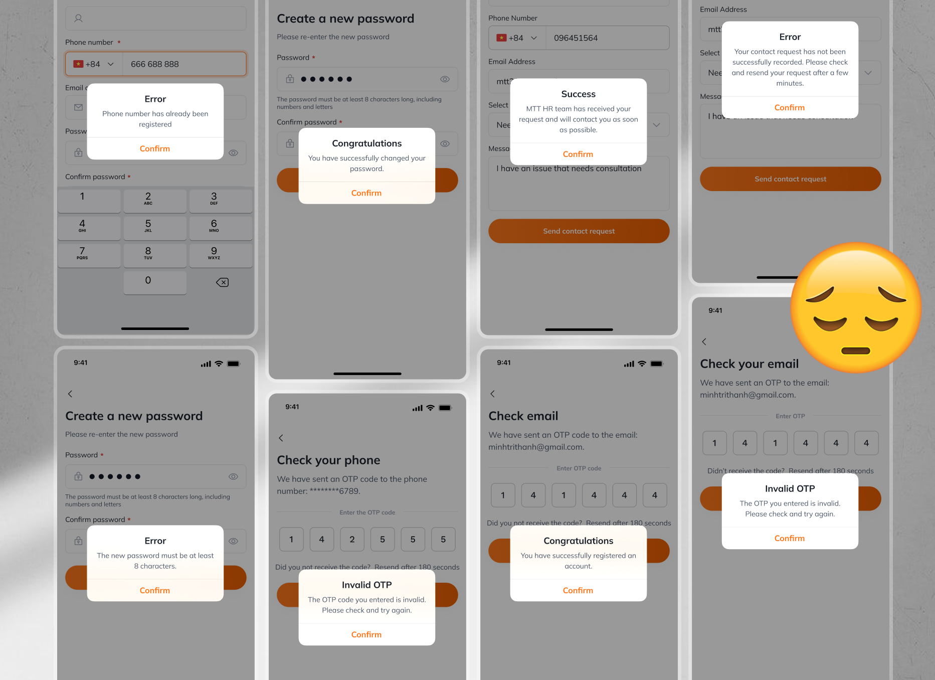
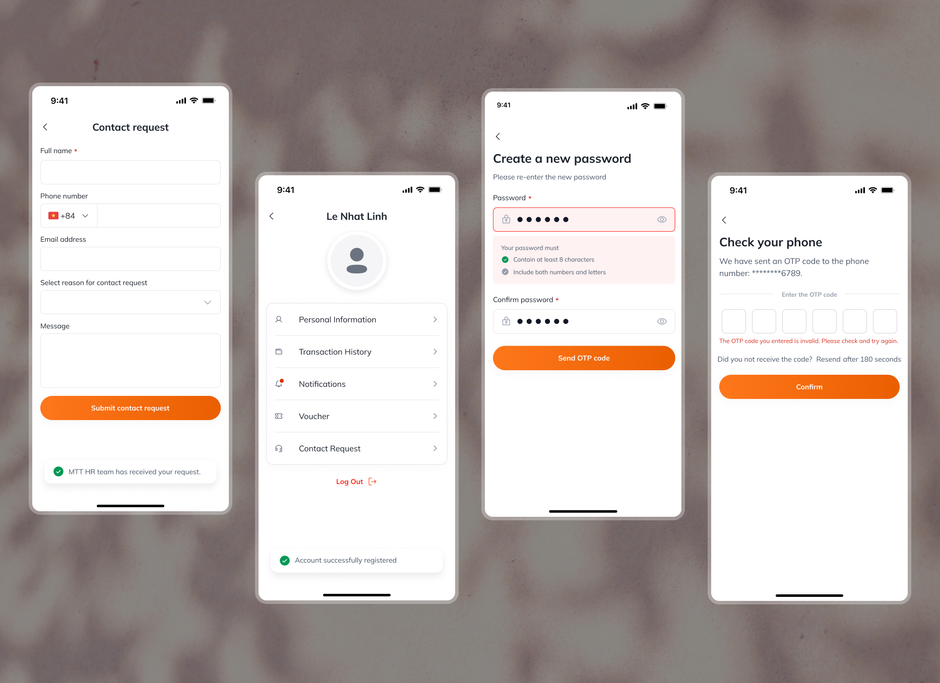
As I was designing, I realized that I was using a alot of modal dialogs as notification. This may disrupt user flows so in the next design iteration, I have switched some modals into more user-friendly notifications like text validations or snackbars.
Before:
After:
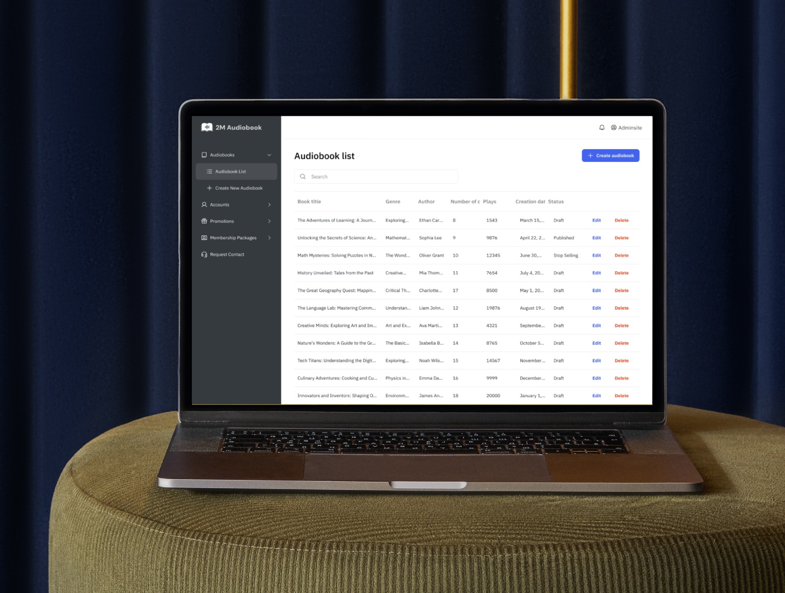
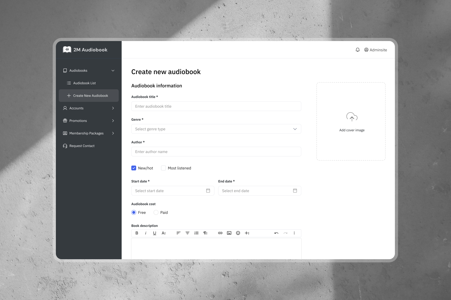
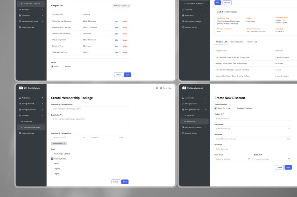
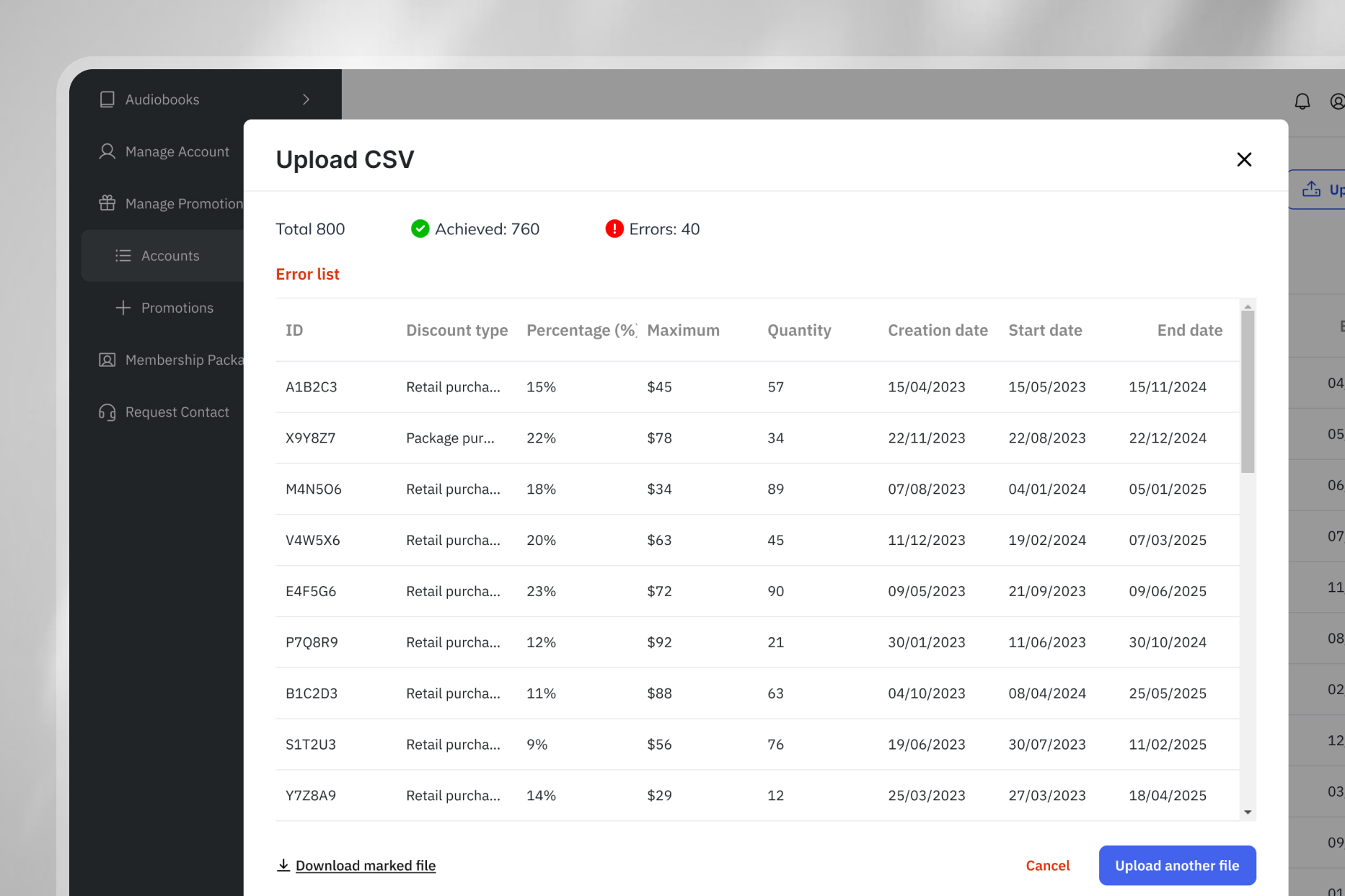
Admin site
Conclusion
While I faced challenges at the beginning, I successfully delivered the final design on time. The client was satisfied with the result.
By preparing for flexibility, I was able to make changes to the design without impacting the overall timeline. Throughout the project, I kept users in mind during the design process. However, the application still needs to undergo A/B testing to maximize user experience and conversion rates.
I also recognized business and technical constraints early on by involving the development team in the design process and taking a proactive approach to planning the application’s functionalities.